|
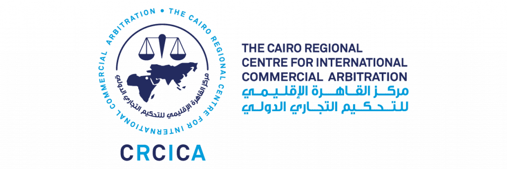
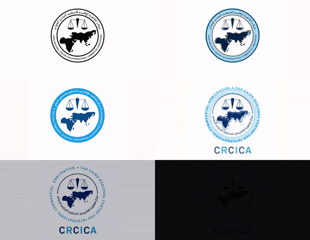
In September 2017, we launched a new logo as part of the ongoing evolution of CRCICA’s brand. Our professional profile has grown and evolved over the last 39 years, and now it is time for a change. We have altered our logo to reflect who we are today and to symbolize our dynamic future. Basically, the new logo crystalizes the acronym “CRCICA” as the Centre’s most popular identification label. Also, the new design of the outside frame is meant to improve the readability of the full name of the Centre in the English/French and the Arabic languages. Symbolically, the framing circle becomes borderless to denote whirling dynamism. Proud as we are of our rich history and deep roots, we retain the logo’s core elements, the scale and the map. The image of the scale stands for justice and the Afro-Asian map reflects the Centre’s regional scope of expertise and roots deriving from the Asian African Legal Consultation Organisation (“AALCO”). The Global Arbitration Review (GAR) reported the new logo to be “highlighting Cairo’s central position between the two continents and potential to balance the interests of both continents in the administration of justice”. The logo was updated by Bonus JT, the Egyptian affiliate of JWT. |
